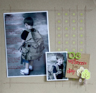
This round's challenge was 2 step stamping. Here is my layout for the challenge. I must have pulled every single stamp out last week experimenting with 2 step stamping. I ended up using the technique for the background and also for the trees. I really liked this technique because its a way of bringing extra color into your stamped images without water coloring. Here is my finished layout...

To create the background, I first sketched in pencil lines creating a grid. This makes it SO much easier when stamping. I then stamped the circular design in Versamark in the middle of the squares.

Next I had to stamp the center dots. I'm a tad bit frugal when it comes to crafting. Ok, my husband would say I'm cheap, lol! When you get the See D's stamps they come already die cut. I couldn't bare to throw away the extra outside rubber so I punched a bunch of holes out with a regular old office hole punch. The rubber is fairly thin so its not too hard to punch out. I originally punched them out with the idea of creating a row of dots or something to stamp with. I used one of those to create the center dot. Yes, a pencil eraser would probably also work great, but with my kids its impossible to find an untouched/unchewed eraser in my house. ;) I first stamped the dot in white and then went back and stamped it in lime. You need the white underneath the lime for it to show up.
I used the pencil lines to machine stitch the vertical lines and then went back and erased the horizontal lines.
The journaling stamp originally had a phrase on the top and a car at the bottom. Really cute stamp, but it didn't work for what I needed. I inked up the stamp, cut a strip of paper the size of the phrase, laid it over the inked stamp. The ink is sticky enough to hold it on. I knew I was covering the car with the tree images so I didn't worry about covering that. Aren't those little trees cute? And they were only a $1! yep, I'm cheap. LOL!
And just one last photo so you can see the journaling. Here's my little cutie-patootie on his first day of Kindergarten.
stamps: October Afternoon (circle design, journal block), See D's (tree, dot)
stickers: American Crafts
cardstock: Prism
ink: Versamark, Colorbox
Now what are you waiting for? Go vote!


7 comments:
What a great layout! I love it! I went and voted...good luck! :)
Wonderful project!!
Love your chewed eraser comment; how true is that?!?
Off to vote for you my friend!
Good luck, Wendy! I love how did the stamping!
teri
Your layout is simply beautiful!!! I love the added details...so pretty! I am on my way to vote for you:)
Cute layout and congrats on being in this phase of the contest! LOVE those trees! Congrats on your shout outs at Card of the Week too, for your layouts!!!
What a great layout, Wendy! I love how you shared your creative process...it's so cool! Love the stitching on this, too!
I'm off to vote! :-D
This page is so great!!!!! You have my vote and I featured your page on my site. I hope you win -- you've earned it!
You were the Scrapbook Page of the Week at Card of the Week.com. You can see the original post here: http://www.cardoftheweek.com/2008/09/scrapbook-sat-2.html.
I did use a picture from your post, with links back to the site and the original post. I hope that is OK. Please feel free to email me if you need me to change anything.
I also have an “I was featured” on badge for you if you want it :D
Post a Comment